Data analysts often need to use multiple subplots within the same image to accumulate different data extracted from various sources or results. In such situations, we need to leverage the power of the Axis class to create sub-plots. This tutorial will give you a quick walkthrough of creating sub-plots and working with them.
What is Matplotlib Axes Class?
Axes is a flexible and easy-to-use class of the Matplotlib that helps produce multiple sub-plots under a single set of axes. With the help of Axes class, data analysts and data science professionals can put the plots at any point or location in the figure. A generated figure can have multiple axes. The position of the origin can be changed through axis square methods. Depending on the graph generating type, the axis can contain 2D or three-axis objects. The figure is the entire space where we can accommodate multiple axes.
Syntax:
axes([left, bottom, width, height])Let us take a closer look at some essential functions of the Axes class.
Example:
import matplotlib.pyplot as pyplot

fig = pyplot.figure()

# The parameters are respectively [left, bottom, width, height]
ax = pyplot.axes([0.1, 0.1, 0.7, 0.8])

# Print the chart
pyplot.show()
Program Output:
 In the axes() function, the axes parameter 0.1 refers to the distance from the distance of the left axis or the bottom from the border of the image. In the example figure, we have not plotted any graph; therefore, it is empty.
Adding Axes Using add_axes() Function
Another alternate way of adding axes to the figure is by using the add_axes() method of Matplotlib. It also takes the same parameter format, adding axes at position [left, bottom, width, height]. Here all the parametric quantities remain in the fractional figures. We can also use the add_axes() function to create multiple subplots in the same figure.
Syntax:
add_axes([left, bottom, width, height])Let us take a practical look at it.
Example:
import matplotlib.pyplot as pyplot

fig = pyplot.figure()

# The parameters are respectively [left, bottom, width, height]
ax = fig.add_axes([0, 0, 0.5, 0.5])
ax = fig.add_axes([0.5, 0.5, 0.5, 0.5])

# Print the chart
pyplot.show()
Program Output:
Legend
Often, you have seen a box or a collection of colors representing what is mentioned in the graph or chart. They are called legends and are a part of the axes class. Adding legend to your plotted figure is possible by calling the legend() function. It takes three arguments.
Syntax:
ax.legend(handles, labels, loc)Here, "handles" are a sequence of patch instances or 2D lines, "labels" define the name as a sequence of strings, and "loc" can be a string or an integer that determines the position or location of the legend within that figure. Here is a program explaining the legend() function:
Example:
import matplotlib.pyplot as pyplot
import numpy as np

G = np.linspace(-np.pi, np.pi, 18)
K = np.cos(G)
S = np.sin(G)

ax = pyplot.axes([0.1, 0.1, 0.8, 0.8])

# 'bs:' mentions blue color, square
# marker with dotted line.
ax1 = ax.plot(G, K, 'r+:')

#'ro-' mentions red color, circle
# marker with solid line.
ax2 = ax.plot(G, S, 'd')

ax.legend(labels = ('Cosine Data points', 'Sine Data points'), loc = 'lower right')
ax.set_title("Basic Trig - Functions")

# Print the chart
pyplot.show()
Program Output:
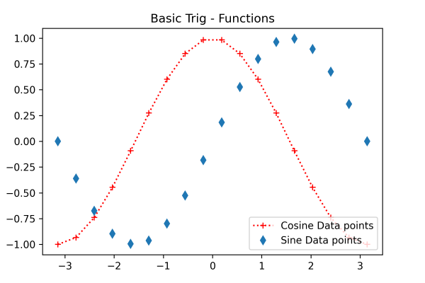 Here the box in the lower right corner is the legend representing the cosine and sine data points.
Plot() with marker codes
Plot() is the most basic axes class method that helps plot the collection of values as lines or markers. Its syntax looks something like this:
Syntax:
pyplot.plot(x, y, 'CLM')Here, x defines the value of the x-axis, y defines the value of the y-axis, and 'CLM' defines the color, line, and marker value. For the color parameter, you can provide the color code or the name
| Character | Color |
|---|---|
| 'b' | Blue |
| 'g' | Green |
| 'r' | Red |
| 'b' | Blue |
| 'c' | Cyan |
| 'm' | Magenta |
| 'y' | Yellow |
| 'k' | Black |
| 'b' | Blue |
| 'w' | White |
In the "line" parameter, you can provide different styles such as dotted line (':'), solid line ('-'), dashed line ('—'), hexagon marker (H), and dash-dot line (-.) You can specify the marker using certain letters and symbols:
| Character | Description |
|---|---|
| '.' | Point marker |
| 'o' | Circle marker |
| 'x' | X marker |
| 'D' | Diamond marker |
| 'H' | Hexagon marker |
| 's' | Square marker |
| '+' | Plus marker |
Example:
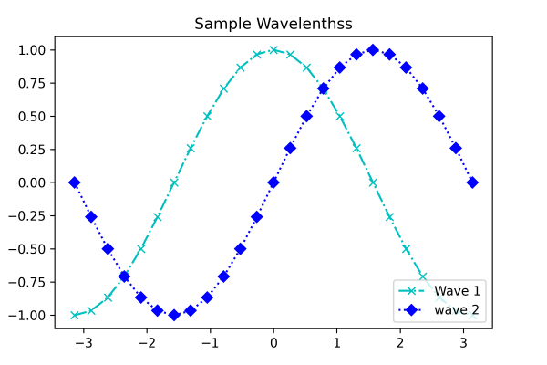
import matplotlib.pyplot as pyplot
import numpy as np

X = np.linspace(-np.pi, np.pi, 25)
C = np.cos(X)
S = np.sin(X)

ax = pyplot.axes([0.1, 0.1, 0.8, 0.8])
ax1 = ax.plot(X, C, 'cx-.')
ax2 = ax.plot(X, S, 'bD:')

ax.legend(labels = ('Wave 1', 'wave 2'), loc = 'lower right')

ax.set_title("Sample Wavelenthss")

# Print the chart
pyplot.show()
Program Output: