Matplotlib is known for its various plots, graphs, and maps. For the presentation of data in these graphical formats, various Matplotlib utilities are used, most of which come under the pyplot submodule. In this tutorial, you will learn about the Pyplot module and how to use it to represent the various data visualizations.
What Is Pyplot In Matplotlib?
Pyplot is a submodule of the Matplotlib module with an interface like that of Matplotlib. It has various graph-generating features that use Python and take the maximum advantage of open-source and being free. Since Matplotlib and its sub-modules are open-source, the developer community also uses them for creating more advanced visualization modules. The pyplot helps create figures, graphs, labels, grids, legends, and other decorative elements. We can import it into our Python code using the import statement and the alias like:
Command:
import matplotlib.pyplot as pyplot
Matplotlib pyplot.plot()
Creating data visualizations for better insights is accessible by using various pre-defined Python modules.
Syntax:
matplotlib.pyplot.plot(*args, scale_x = True, scale_y = True, data = None, **kwargs)
Example:
import matplotlib.pyplot as pyplot
pyplot.plot([4, 3, 2, 1], [1, 2, 5, 6])
pyplot.axis([0, 7, 0, 10])
pyplot.show()
Program Output:
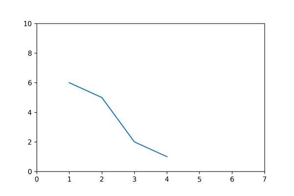
In the above example program, the plot() function accepts the x-coordinates (4, 3, 2, 1) and y-coordinates (1, 2, 5, 6) in a linear graph where the scale is specified. The function plot() takes multiple parameters and enables developers to set axes scales and format the graphs. These methods and their parameters are described in detail below:
| Function | Description |
|---|---|
| plot(x, y) | It helps plot the x and y values with the help of the default line style and color. |
| plot.axis([x_min, x_max, y_min, y_max]) | It helps scale the x-axis and y-axis from minimum (0, 0 coordinate) to maximum values (max, max). |
| plot(x, y, color = 'color-name', marker = 'marker-type', linestyle = 'line-style-name', linewidth = 3, markersize = 10) | Here the x and y coordinates are changed from blue to other color_name and can be marked using various shapes such as circles, diamonds, etc. These markers can be of varied sizes and widths. |
| plot.xlabel('X-axis') | Naming the x-axis with a label. |
| plot.ylabel('Y-axis') | Naming the y-axis with a label. |
| plot(x, y, label = 'Sample line') | It helps draw a sample line displayed as a legend. |
Line Formatting for Linear Plots
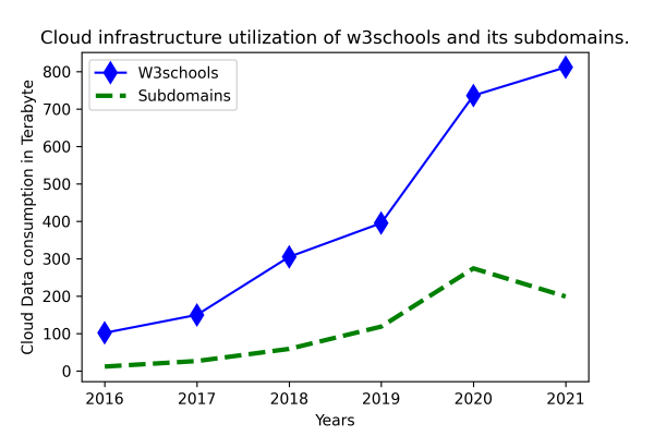
Here, we have a Python program for using a marker and its sizes and their respective color in a plot:
Example:
import matplotlib.pyplot as pyplot

# Manual data setup
year = [2016, 2017, 2018, 2019, 2020, 2021]
w3schools = [101.6, 149.61, 304.54, 394.96, 735.79, 811.38]
subdomains = [11.5, 26.22, 58.66, 118.26, 273.87, 198.72]

# line style formatting
pyplot.plot(year, w3schools, color = 'blue',
        marker ='d', markersize = 10,
        label = 'W3schools')
pyplot.plot(year, subdomains, color = 'green',
        linestyle = 'dashed', linewidth = 3,
        label = 'Subdomains')

# layout configuration
pyplot.xlabel('Years')
pyplot.ylabel('Cloud Data consumption in Terabyte')

# Setting the title of the entire plot at the top.
pyplot.title('Cloud infrastructure utilization of w3schools and its subdomains.')

# A legend defines a region that describes the elements of the graph.
pyplot.legend()

# Save the chart file
#pyplot.savefig('filename.png', dpi=300)

# Print the chart
pyplot.show()
Program Output: