Visualization is the perfect form of representing data so that developers can understand what the data wants to express. It also gives a clear insight into the data demonstrating approaches. But not all data requires the same format of representation. That is where Matplotlib comes with different ways of generating visuals against data. This tutorial will explain the different types of two-dimensional plotting systems that Matplotlib pyplot can render.
What Are Plots (graphics)?
Plots (graphics), also known as charts, are a visual representation of data in the form of colored (mostly) graphics. It tells its audience the story about the data relationship through data points, lines, symbols, labels, and numbers so that professionals and anyone with limited knowledge of reading data can get a fair idea of what the data is trying to show. We can use the Matplotlib visualization library in Python to portray the graphs.
Plot Types
- Line Plot
- Bar Plot
- Scatter Plot
- Pie Plot
- Area Plot
- Histogram Plot
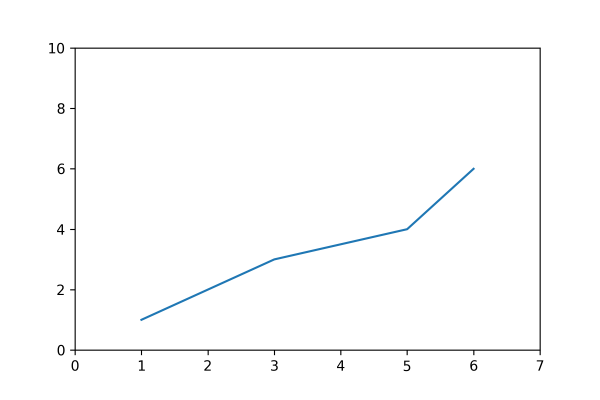
Line Plot
Line plots are drawn by joining straight lines connecting data points where the x-axis and y-axis values intersect. Line plots are the simplest form of representing data. In Matplotlib, the plot() function represents this.
Example:
import matplotlib.pyplot as pyplot

pyplot.plot([1,2,3,5,6], [1, 2, 3, 4, 6])
pyplot.axis([0, 7, 0, 10])

# Print the chart
pyplot.show()
Program Output:
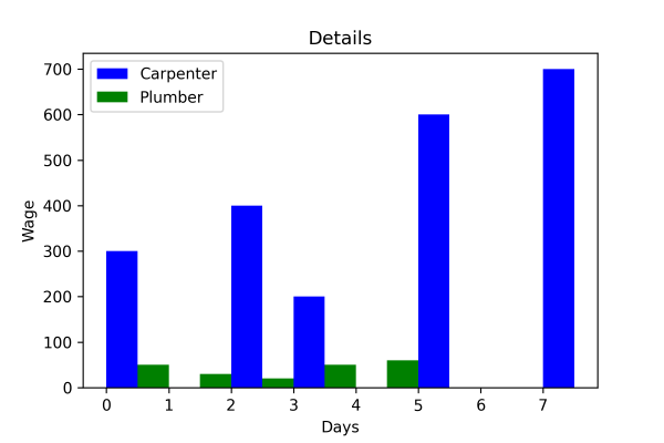
Bar Plot
The bar plots are vertical/horizontal rectangular graphs that show data comparison where you can gauge the changes over a period represented in another axis (mostly the X-axis). Each bar can store the value of one or multiple data divided in a ratio. The longer a bar becomes, the greater the value it holds. In Matplotlib, we use the bar() or barh() function to represent it.
Example:
import matplotlib.pyplot as pyplot

pyplot.bar([0.25,2.25,3.25,5.25,7.25],[300,400,200,600,700],
label="Carpenter",color='b',width=0.5)
pyplot.bar([0.75,1.75,2.75,3.75,4.75],[50,30,20,50,60],
label="Plumber", color='g',width=.5)
pyplot.legend()
pyplot.xlabel('Days')
pyplot.ylabel('Wage')
pyplot.title('Details')

# Print the chart
pyplot.show()
Program Output:
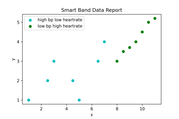
Scatter Plot
We can implement the scatter (previously called XY) plots while comparing various data variables to determine the connection between dependent and independent variables. The data gets expressed as a collection of points clustered together meaningfully. Here each value has one variable (x) determining the relationship with the other (Y). We use ht
Example:
import matplotlib.pyplot as pyplot

x1 = [1, 2.5,3,4.5,5,6.5,7]
y1 = [1,2, 3, 2, 1, 3, 4]
x2=[8, 8.5, 9, 9.5, 10, 10.5, 11]
y2=[3,3.5, 3.7, 4,4.5, 5, 5.2]
pyplot.scatter(x1, y1, label = 'high bp low heartrate', color='c')
pyplot.scatter(x2,y2,label='low bp high heartrate',color='g')
pyplot.title('Smart Band Data Report')
pyplot.xlabel('x')
pyplot.ylabel('y')
pyplot.legend()

# Print the chart
pyplot.show()
Program Output:
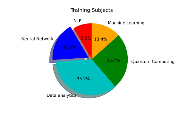
Pie Plot
A pie plot is a circular graph where the data get represented within that components/segments or slices of pie. Data analysts use them while representing the percentage or proportional data in which each pie slice represents an item or data classification. In Matplotlib, the pie() function represents it.
Example:
import matplotlib.pyplot as pyplot

slice = [12, 25, 50, 36, 19]
activities = ['NLP','Neural Network', 'Data analytics', 'Quantum Computing', 'Machine Learning']
cols = ['r','b','c','g', 'orange']
pyplot.pie(slice,
labels =activities,
colors = cols,
startangle = 90,
shadow = True,
explode =(0,0.1,0,0,0),
autopct ='%1.1f%%')
pyplot.title('Training Subjects')

# Print the chart
pyplot.show()
Program Output:
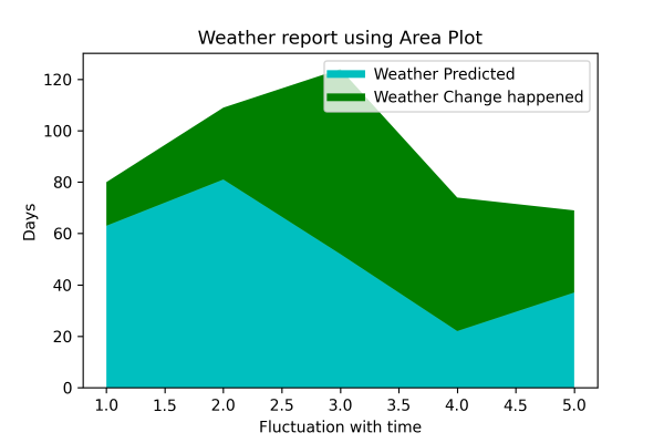
Area Plot
The area plots spread across certain areas with bumps and drops (highs and lows) and are also known as stack plots. They look identical to the line plots and help track the changes over time for two or multiple related groups to make it one whole category. In Matplotlib, the stackplot() function represents it.
Example:
import matplotlib.pyplot as pyplot

days = [1,2,3,4,5]
age =[63, 81, 52, 22, 37]
weight =[17, 28, 72, 52, 32]
pyplot.plot([],[], color='c', label = 'Weather Predicted', linewidth=5)
pyplot.plot([],[],color = 'g', label='Weather Change happened', linewidth=5)
pyplot.stackplot(days, age, weight, colors = ['c', 'g'])
pyplot.xlabel('Fluctuation with time')
pyplot.ylabel('Days')
pyplot.title('Weather report using Area Plot')
pyplot.legend()

# Print the chart
pyplot.show()
Program Output:
Histogram Plot
We can use a histogram plot when the data remains distributed, whereas we can use a bar graph to compare two entities. Both histogram and bar plot look alike but are used in different scenarios. In Matplotlib, the hist() function represents this.
Example:
import matplotlib.pyplot as pyplot

pop = [22,55,62,45,21,22,34,42,42,4,2,8]
bins = [1,10,20,30,40,50]
pyplot.hist(pop, bins, rwidth=0.6)
pyplot.xlabel('age groups')
pyplot.ylabel('Number of people')
pyplot.title('Histogram')

# Print the chart
pyplot.show()
Program Output: