This Python tutorial has a simple program to generate two-dimensional Radar charts using the Plotly Graphing Library. Plotly is a comprehensive graphs library to build detailed plots more efficiently.
The radar chart is also known by different names due to its design, such as star chart, spider chart, web chart, spider web chart, star plot, polar chart, cobweb chart, circular graph, etc. It is useful when the relationship between data points is shown through radii and angles.
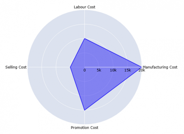
The following Python code creates a basic radar chart using sample data of a product's production cost:
Example:
An example of creating a radar plot using Plotly Express:
import plotly.express as px
import pandas as pd
data = pd.DataFrame(dict(keys=[10000, 20000, 15000, 5000],
values=["Labour Cost", "Manufacturing Cost", "Promotion Cost", "Selling Cost"]))
figure = px.line_polar(data, r='keys', theta='values', line_close=True)
figure.update_traces(fill="toself")
figure.show()
Program Output:
Install Plotly
The Plotly Python library is installed using pip (package manager for Python). The following command installs the Plotly package:
pip install plotly
Plotly Express is a built-in part of the Plotly library, so it is not necessary to install it separately.